A new website for ASSA ABLOY

2026 is an important year for our company: it marks the beginning of a new phase that will not so much change who we are, but rather encourage us to reflect on who we have become and how to communicate this more effectively to our customers.
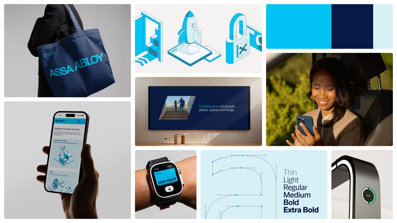
Our website has been completely redesigned to bring together the strength and expertise of our group.
A new strategy, a new brand identity
Our visual identity has undergone a major restyling, highlighting what makes ASSA ABLOY unique.
Blue is our colour; it is what makes us instantly recognisable to our customers and the world. It is much more than just a shade: it is a strategic signal that clearly indicates who we are. For this reason, we have decided to use different shades of blue to consolidate our heritage and as a starting point for building the future.
ASSA ABLOY is not only the name of our company, but also our logo. The two words that form the two founding pillars of our Group (created in 1994 from the merger of ASSA and ABLOY) are also the most distinctive feature of our identity.
When it comes to writing, typography is an essential component of visual identity: it helps define how our brand appears and is perceived. The new typeface we have created, Access Sans, is modern, clear and highly legible; it welcomes people inclusively across all our communication channels.
The two initials of the words ASSA and ABLOY also give rise to our new distinctive graphic shape, which we have named Access Shape, a new element that is modelled on our DNA. This shape cuts through space in a soft way, changing perspective and opening up new possibilities.